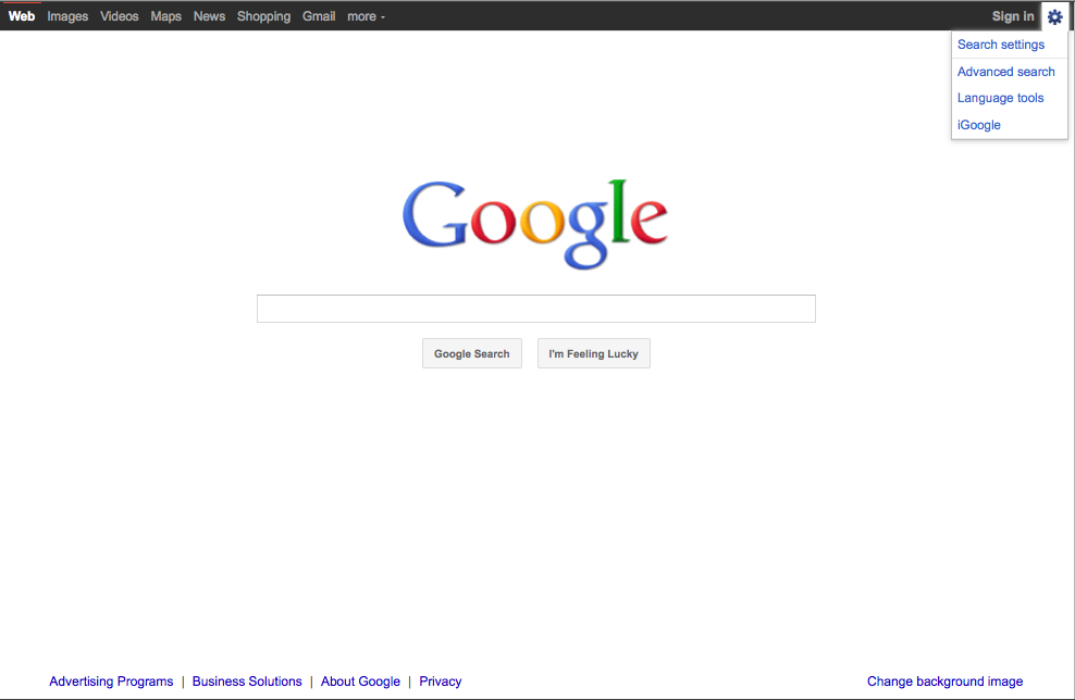
Google has redesigned its Web Search home page. There has been alot of discussion online about the black bar across the top of the new design, the choice of the red "overline" and white for the active "tab", and gray for other available tabs. Some people have even chosen to focus on the new square buttons to activate the "Google Search" and "I'm Feeling Lucky" features that replaced the old rounded buttons. These really all just amount to cosmetic differences.

For us, however, the biggest change to the homepage - and the biggest mistake in the new design - was Google's decision to move access to the "Advanced Search" page to the settings "gear" in the upper right-hand corner. Previously, the link to the Advanced Search page was clearly visible to the right of the search box.

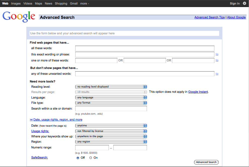
Aside from the black bar at the top of the Advanced Search page, its design and functions remain unchaged.
| Attachment | Size |
|---|---|
| Picture 56.png | 58.12 KB |
| Picture 58.png | 110.28 KB |
THE LATEST INTERNET RESEARCH TIPS
Read the latest strategies, tips and new resources available for integrating the Internet into your law practice in our newsletter.


